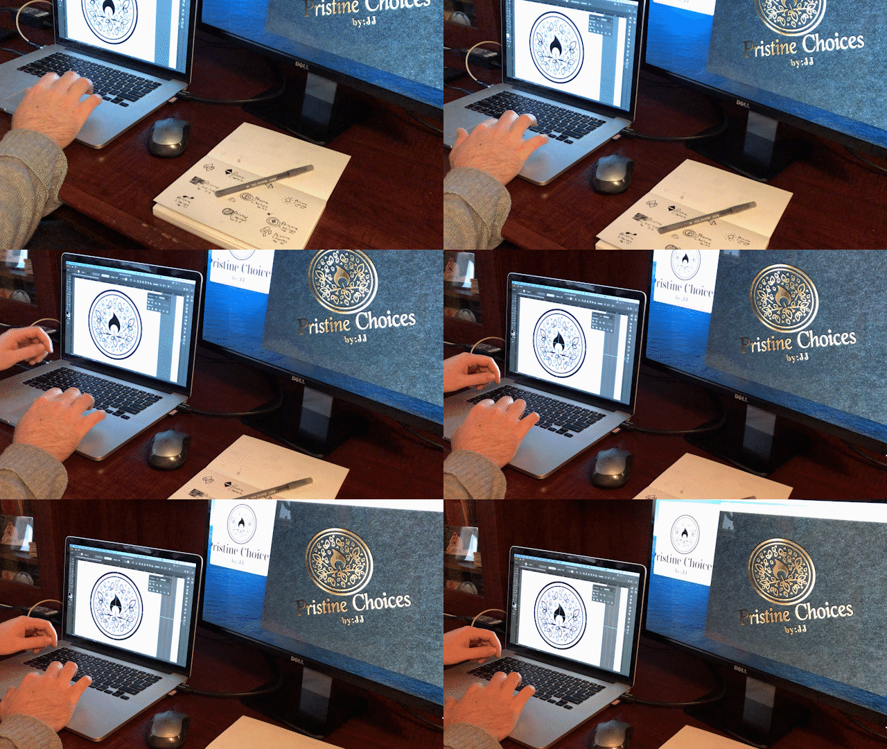
Branding and Logo Design

Clear.
Simple.
Bold.
Make Them feel like Royalty
Crowned Treatz
People always want to work with you if they feel heard, valued, and respected. It’s that personal connection that allows both designer and client to be authentic with each other — and that leads to some awesome creative solutions!
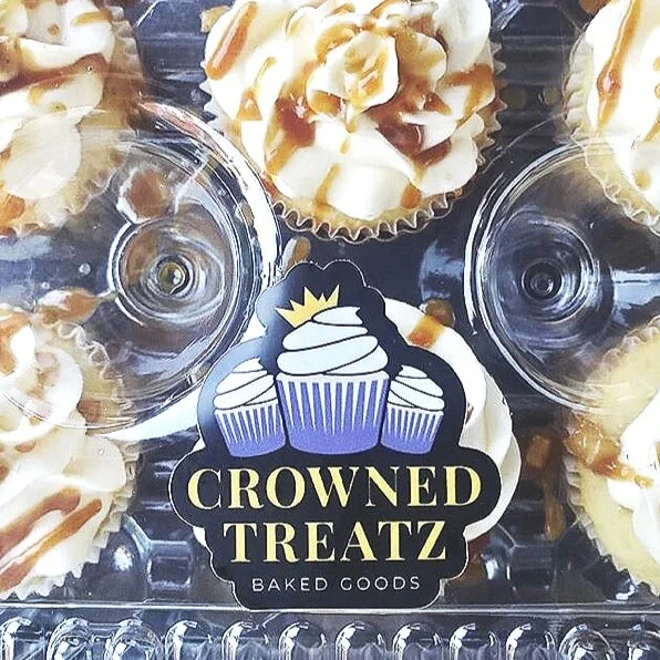
The owner of Crowned Treatz Baked Goods reached out with a rough sketch and a dream. After a brief consultation we developed a clear visualization of his brand. The name “Crowned Treatz” was inspired by His last name, “King.” Using bold colors of purple and yellow, and using thick simplified Lines — the Tri-Cupcake Icon was coronated.
“I really appreciate your professionalism from beginning to end... Doing Business was a pleasure and I will be sure to recommend you to anyone I know in need of a logo.”

Full Color on Black Background

One Color On Black Background

Reversed Logo : White on Black

Full Color On White Background

One Color on White Background

Black and White
Shake Things Up!
Infinity Juice
In the creative business sometimes you have to get even more creative. Sometimes you have to scale back — just because it’s a direction doesn’t mean it’s not a misdirection.
When I first started working with Infinity Juice we were bouncing so many Ideas at each other that we got pretty far out there. In fact — the original concept was “Galactic Juice.” Juice that’s just so good “it’s out of this world!”
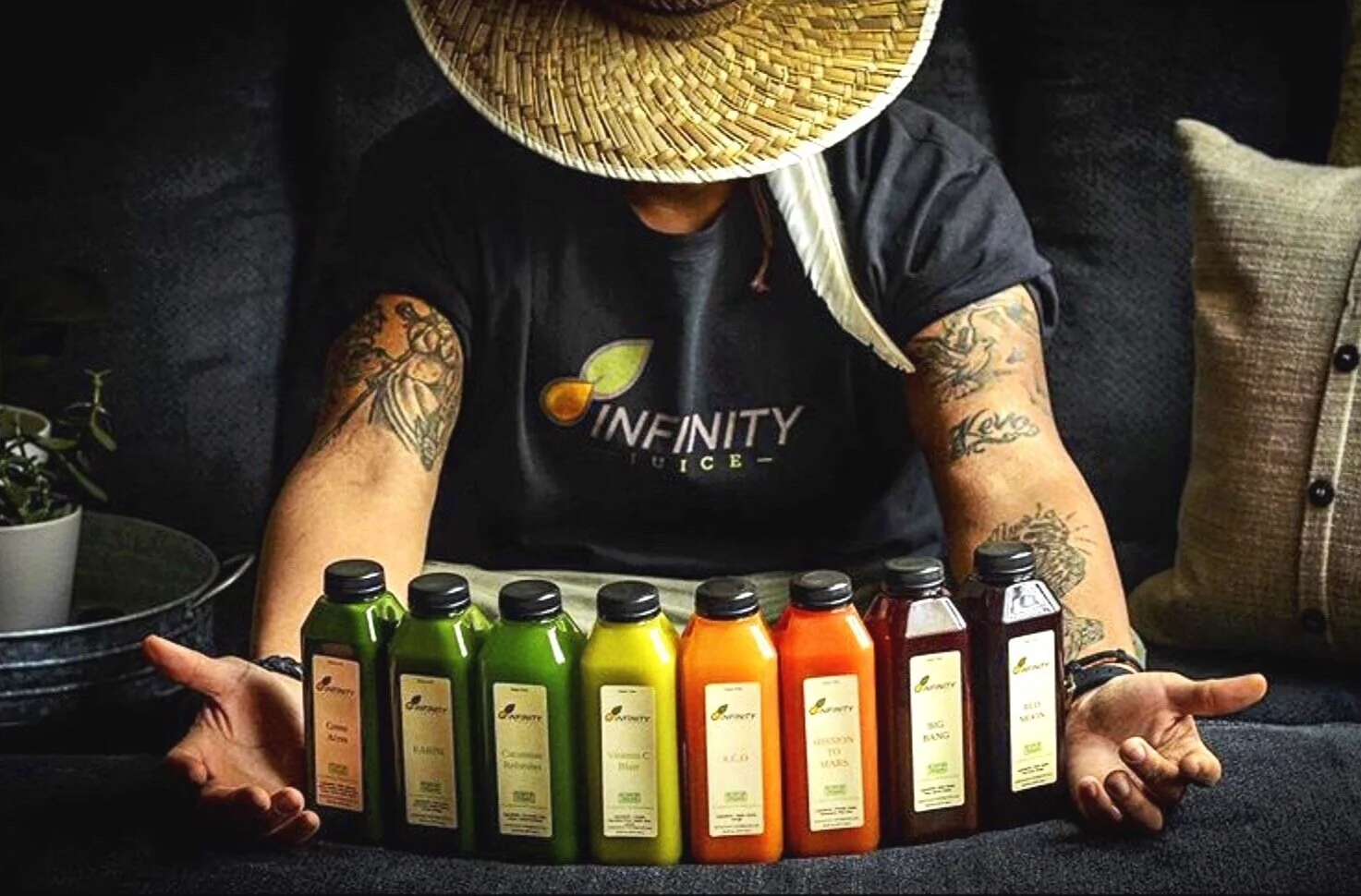
The problem was that people like to purchase what they trust and know. “Galactic Juice” wasn’t relatable. So we approached the concept from a different angle — Infinity Juice, “everything the earth provides to keep you going.”

Computer Roughs

Revised Icons from Roughs

Concept 1 and Concept 2

Final Draft

Full Color

Black and White

One Color Dark

One Color Light

Reversed Black and White

Full Color Dark Background
You never know
What You’ll do next

The Greater Philadelphia Amazon Web Service User Group
Opportunities sometimes come unexpected — while they may catch you off guard — roll with them and see where they may take you.
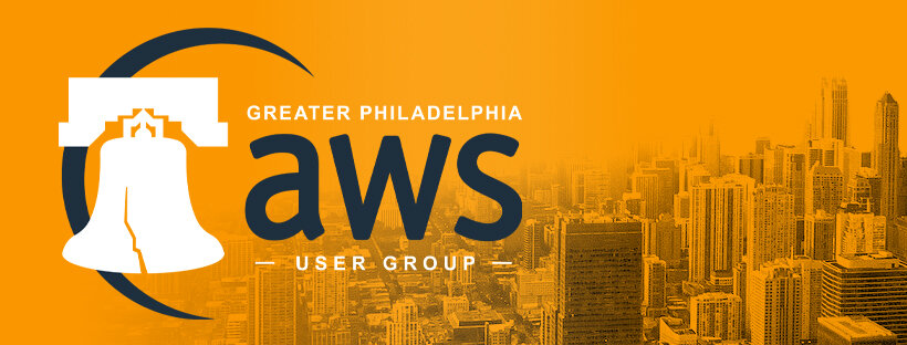
The Greater Philadelphia Amazon Web Service User Group, or the “GPAWSUG” was searching for a new look. One of my college acquaintances was working with Alpine Cyber Solutions to find a solution to their logo predicament. The name had too many words and the acronym didn’t make sense to the public. Also, Amazon required that elements from their branding manual be used to be associated.
He reached out initially for consultation — but after some deliberation with his team they agreed to hire me for the job.
The name was the hardest part — figuring out how to represent all the words. We agreed on a half words half acronym mix, since AWS is a coined Amazon term.
Using the branding manual and style guides The final product features the classic Amazon Orange and Squid Black Colors. For representation of Philadelphia as suggested by Alpine Cyber Solutions I incorporated a bold solid outline of the Liberty Bell. I also wanted to play with the element of the Amazon swoosh so I sketched one into the background to tie all the elements together and hold them in one space.


